Colour Me Happy: Is There More To It Than Meets The Eye?
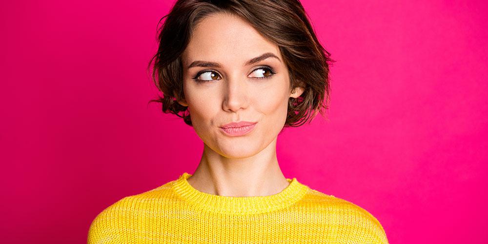
From hazy pastels to dazzling jelly bean shades, sing-song colours are popping up across the fashion spectrum–and we’ve noticed that many of you have succumbed to the lure of jewel-coloured frames in 2020. A tiny act of defiance—radical optimism, even—in the face of a global crisis. Designers everywhere clearly support the idea that bright hues evoke joy, but is there any evidence?
The psychology of colour
According to Professor Byron Mikellides of the Oxford Brooke’s School of Architecture and a leading expert in colour psychology, the power of colour to influence our mood does appear to have foundations. Humans perceive more colours than most mammals—with only monkeys and apes sharing similar abilities. It’s a skill that evolved to support our biological survival.
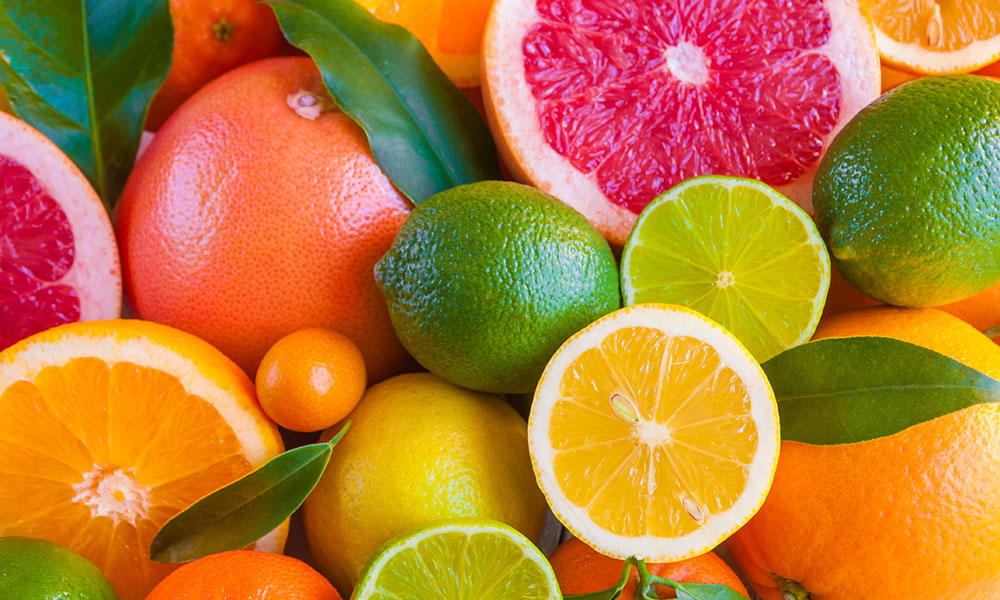
Cambridge-based neuropsychologist Nicholas Humphrey also writes that the colours of nature—bird plumage, pigments in fruit and flowers—act as visual signals, an evolutionary heritage to which we still respond. Regardless of the message, these colours commonly have three functions: to catch attention, transmit information, and influence the viewer’s emotions.
How is that playing out in this season’s colour trends?
Fortitude and optimism
In 2020, before the pandemic, Pantone—the company that forecasts color trends—picked Classic Blue as its ‘Colour of the Year’. This year, breaking with tradition to have not one but two colours, Pantone has chosen dependable, rock-solid, Ultimate Grey—reminiscent of pebbles on a beach—and Illuminating, which radiates vitality and positivity. Together, they marry strength and hope.
Quite by chance, we’ve incorporated Pantone’s colours of the year into our new refurbishment, with grey walls in the dispensary and gorgeous sunny yellow chairs in reception. Everyone comments on those cheery chairs—they’re impossible to miss, even from the street!
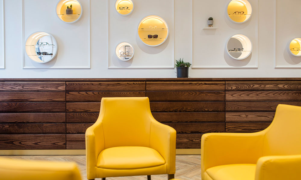
Image by Ian Olsson
Of course, we’re not saying you have to wear grey and yellow together—that’s not going to be everyone’s cup of tea. However, Pantone’s choice does seem to support the idea that as we look for ways to navigate uncertainty, we gravitate towards vivacious, emboldened shades to lift our spirits and steadfast, elemental colours to ground us.
Luckily, one of the easiest ways to inject a little colour into your life is through your eyewear.
Join the colour movement
The science is in—everyone feels better in color. Eye-catching frames not only get you noticed but also show off your personality. And you get to put a smile on the faces of anyone who has the pleasure of seeing you—bringing a little joy to those daily Zoom calls?

When you visit for your eye exam, you’ll notice this passion for colour, in every possible combination, right across our eyewear collections, from the big, bold designs by Anne et Valentin to the colour blocked wood frames of Feb31st. They’re all turning heads, cranking up the volume, and impossible to ignore.
So, with something to suit all face shapes and colourings, could 2021 be your year to go bright?